Screen Print (Homemade)
|
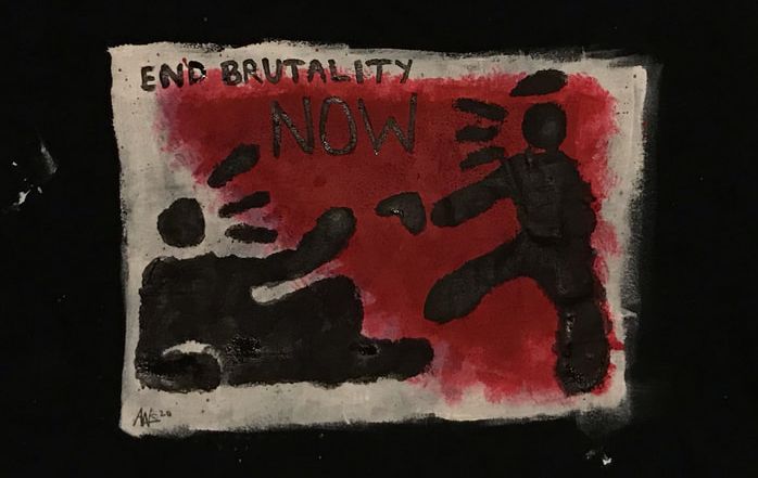
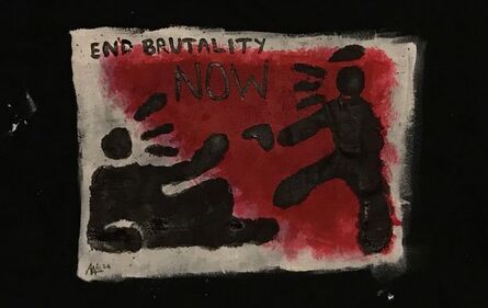
Untitled27cm x 24.5cm
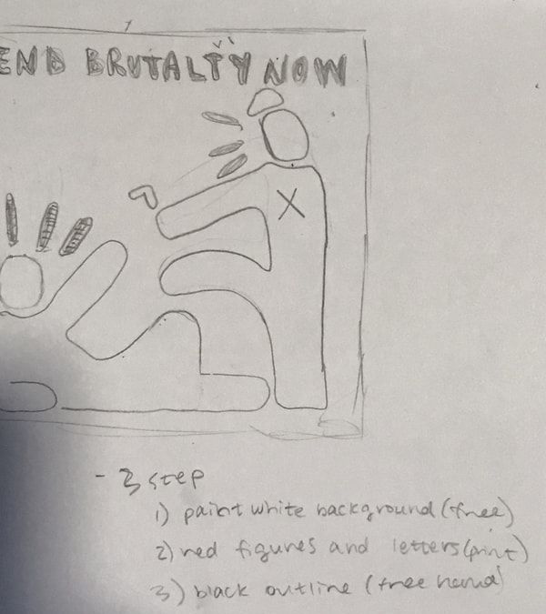
Homemade paint medium and paint mix on cotton shirt June 2020 Exhibition Text:Untitled is an original screenprint design on a cotton tee shirt, depicting an image of a police officer and civilian holding their hand out in front of a gun pointed at them. Above the two figures is the phrase "End Brutality Now", and the image itself is meant to draw attention to police brutality in the US and highlight the fear of law enforcement in the country right now (and throughout history). The design is inspired by work by Keith Haring, an artist from the late 80s and 90s known for his striking graphic images and bold texts. I was also inspired by the work of Favianna Rodriguez, a social justice activist and artist who has become known for her striking combination of text and illustration in a graphic way.
|
Planning
Inspiration
|
My first inspiration for this project was work by the artist Keith Haring. Haring's creative career began with commercial graphic design in the late 70s, but he decided to move to New York City after just two semesters at Ivy School of Professional Art in Pittsburgh. In New York, he became enthralled in the alternative art and club scene. He enrolled in the School of Visual Arts (SVA) and became friends with popular artists like Jean-Michel Basquiat while participating in events at alt venues, such as Club 57. In 1980, Haring discovered an innovative way to create art that would speak to a larger audience; Haring drew on unused subway advertising boards that were covered in black paper. These drawings were able to be produced quickly, and over the course of the following decade, Haring was able to create hundreds of these graphic pieces, which have created a long lasting legacy all over the world.
My second inspiration for this piece is the social justice activist and artist, Favianna Rodriguez. She grew up in Oakland, California as a first generation American- Latinx , amid the crack cocaine epidemic and birth of hip hop. Her work largely focuses on migration, gender and racial justice, and sexual freedom. She uses art to express her perspective as a woman of color living in the US, and a self described "American Latinx artist with Afro-Latinx roots,"* (see source list). While she is largely known for her visual work, including a collaboration with the internationally known ice cream brand Ben and Jerry's, she also practices writing, power building and community organizing. She co-founded and is president of The Center for Cultural Power, which highlights the intersection of art, culture, and racial equity. |
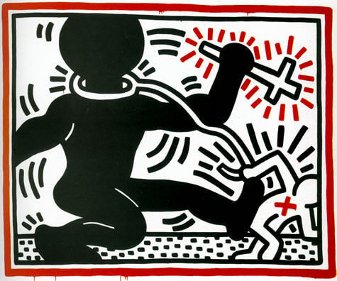
Haring, Keith. "Untitled (Apartheid)". 1984
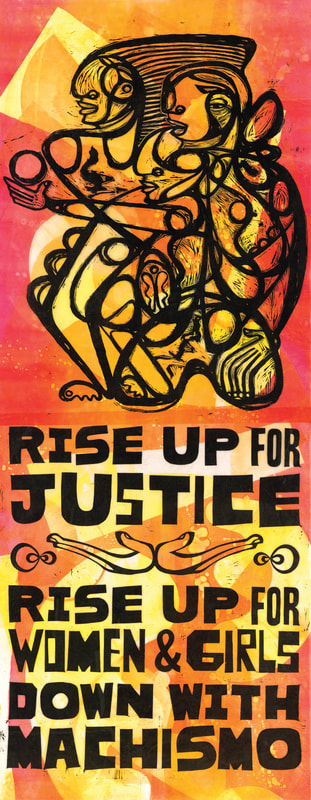
Rodriguez, Favianna. "Down With Machismo EV 2/3". 2014
|
|
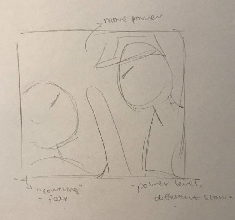
Planning SketchesBy the time I had gotten to the stage of actually sketching out the design for the shirt, I already had a rough idea of what I wanted to show through the print. The civil unrest that has recently created large demonstrations throughout the country has been really inspiring. And it has also been really eye opening to me. As a young white person, I understand that I have an unconscious privilege because of the color of my skin, and that my BIPOC peers are unjustly incarcerated and killed by law enforcement. While I wanted to create something to express my views on what is happening right now, I wanted it to be to the point and I wanted it to be applicable to the overarching injustice, rather than a peculiar incident. Right away I thought of Keith Haring and his bright designs with short phrases, and I also thought of Favianna Rodriguez and how she is able to connect art and activism so well. So, throughout my sketches, I knew I wanted to have a stick figure/form with no face and a stark phrase. the colors of the background also needed to stand out.
|
Process
Experimentation
|
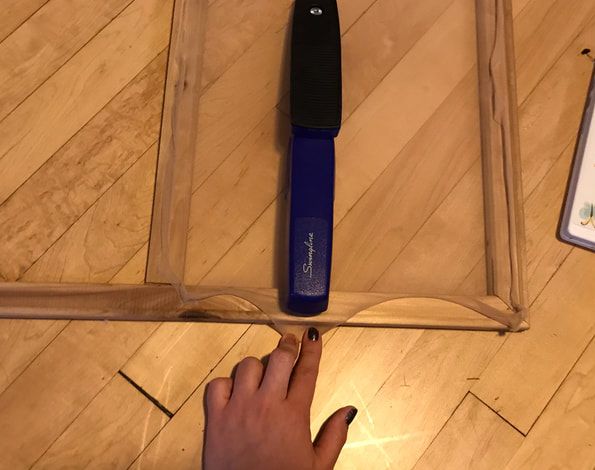
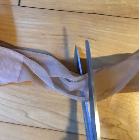
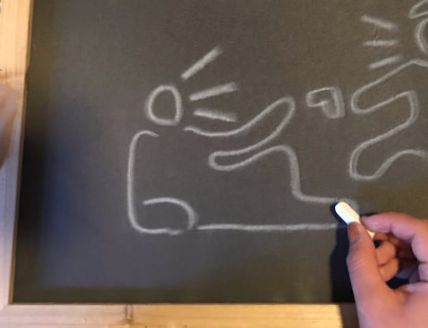
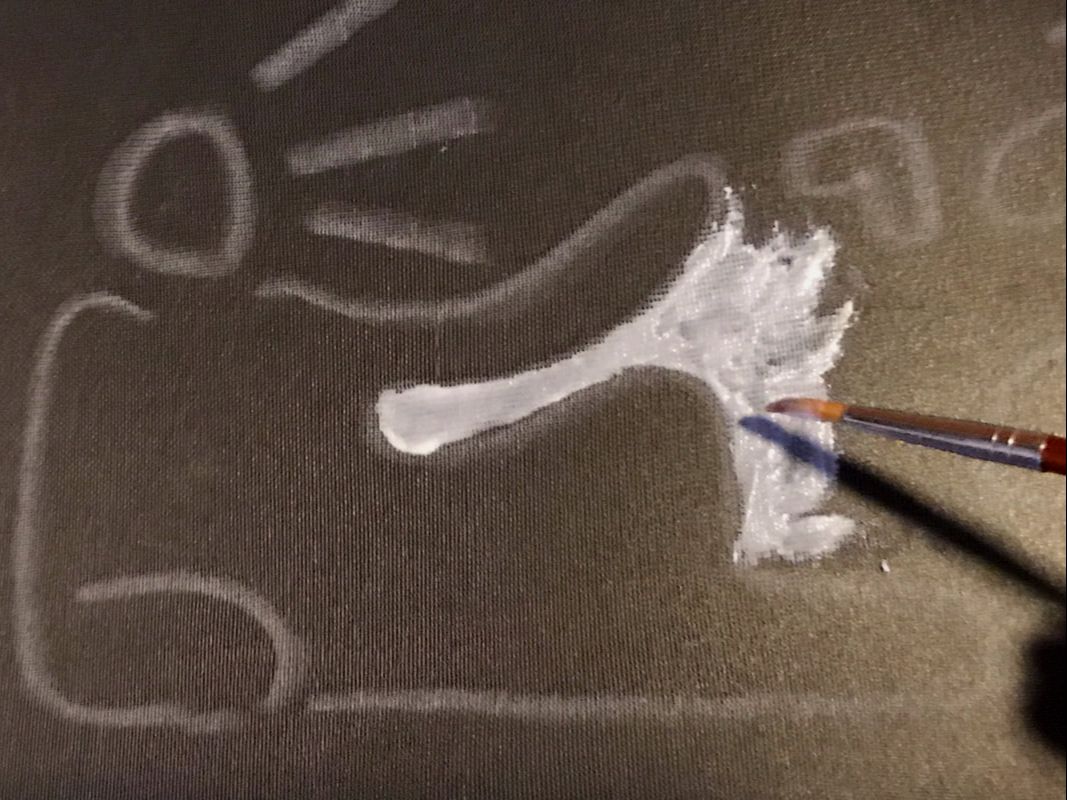
The experimentation in my project is based on the actual construction of the screen used to make the print. One thing that has changed over the course of living through the pandemic, is having to solve problems in more creative ways. Since I'm not in school, I haven't had access to the art materials that I got used to being at my disposal. One of my first thoughts was to create my own way to screen print. Print making is one of my favorite ways to create, but screen printing is one that I had not yet tried before. I first cut a square from old stockings and stretched it over a wooden frame that I had, stapling it into place; this was a technique that I learned in school when we would make our own canvasses for painting. I then used mod podge to block out the final design, but after I started to block out the letters, I realized it would be best to write the words free hand. I also experimented with the fabric paint medium, where I found that I could mix white vinegar and glycerin with a little water.
|
|
Process
|
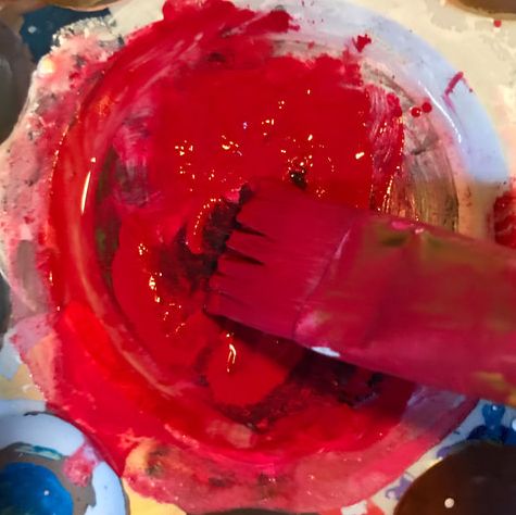
As aforementioned, my first step in completing this project was to block out the print in my screen with mod podge. Before going in with the mod podge, I used some white chalk to lightly sketch the design. I wanted to do this because it would be easier for me to see where the mod podge would go. I then mixed my paint medium with paint, in order for it to be suitable for the shirt, with a ratio of two parts acrylic paint to one part paint medium. After that was mixed, I began to paint the background color that the print would be placed on top of. Since the first shirt I was using was black, I made the background red and white. These colors stand out strongly against the black of the shirt and of the print, but they also represent two contrasting themes. innocence and danger/bloodshed. (this adds a layer of symbolism to the piece). I used a round headed brush to push paint through the parts of the screen that were not blocked off by the mod podge in order to transfer the design onto the shirt, and repeated this another time to make sure that the design was clearly visible.
|
|
Compare and Contrast
|
Haring, Keith. "Untitled (Apartheid)". 1984
|
Schwartz, Alina. "Untitled". June 2020
|
Similarities:
- Bold use of color and contrast to create a striking image. The color symbolism of red and white represent a presence of both innocence and of danger. They are both pieces that are meant to highlight social injustice; Haring's piece is a part of a posthumous exhibition called "Keith Haring: The Political Line", that highlights his more political work. The specific piece I chose to compare mine to is about the Apartheid in South Africa, and so the color of the two figures also comes in to play; one figure is Black and the other is white, and this is Haring showcasing the power struggle between Black and White South Africans during the Apartheid in the 80s. My piece is expressing the desire to end police brutality in a response to the unjust killings of Black and non-Black POC in the United States. While there is no difference in color between the two figures, the color use in the background of the print is intentional: on the left side, there is white paint, and on the right there is red paint. The red paint was applied in a way that made it seem as though the red (danger, police brutality) was seeping into the white (innocence/safety of the BIPOC community).
- Another similarity between the two pieces is the stylistic choice that I made when taking inspiration from Keith Haring's work. Haring is famous for his simple yet bold style, featuring stick figures, bright colors, and bold texts. I wanted to emulate this in my piece as well. Haring believed in making art accessible for everyone, versus only "high class" people in the past. I think this adds another layer of importance when looking at the context of both of these pieces, because they both have to do with commentary on worldly events. It is (and was, for Haring at the time he made Untitled (Apartheid) more important to get the message across that what was happening in the world was important. Haring wanted to quickly show the power struggle and racism during the Apartheid, and I also wanted to have a bold image showcasing the reality of policing in the US right now.
Differences:
- The subjects of both of the pieces, while both dealing with racial justice, are focused on different issues. Haring's piece comments on the apartheid in South Africa
- The two pieces showcase a difference in power between the two figures. Haring's piece showcases both a white figure and a black figure. Since the subject of the piece has to do with the Apartheid, I could infer that the two figures represent both the white population and Black population of South Africa. The white figure is holding a leash attached to a collar around the Black figure's neck, but the latter is much larger than the white figure; it is also kicking the white figure from behind. According to research that I did, the struggle against Apartheid started to pick up a lot of steam in 1984- riots had begun to break out in Transvaal and continued for two years. The piece comments on the slow but sure rise to strength and power of Black South Africans over the white supremacy instilled in the country. My piece deals with police brutality, something that has always been present but has only recently "come to light" in the media. My piece showcases two black figures, and I did this because it is not only white cops killing innocent Black people. Cops of all races are abusing their power all over the nation, and so I showed this in my print using not only certain colors (or lack thereof) but a different composition as well. The figure that represent law enforcement is looming over the other figure, pointing a gun at them. The other figure lays on their back, a hand out against the gun that the police officer is pointing at them. This also represents the fact that many people who have been killed at the hands of police have been unarmed, and/or completely innocent.
Reflection
I am overall satisfied with this project. It was really interesting to try and create something like this with no outside materials, and I am happy to have learned how to make prints from a screen with things around my house. It was difficult to get the same level of precision that I would most likely been able to have if I had used professional screen printing materials, but I understand that I had my own limits when it came to this kind of printing. The research I did for this project was very interesting, because I had no prior knowledge of Haring's form of activism through his art, and that he often created under a political scope. I tried to imitate Haring's artistic style because I believed that it would translate well to the theme of my piece. When I started to think about what I wanted to screen print, I knew I wanted to create something stemming from the civil unrest that is happening all over the world right now. I, of course, have an innate privilege because of my race, and so I knew that I wanted to have a good amount of research before I just made whatever I wanted based on police brutality. The main problem that I had while making this project was the fact that my print ended up being a bit messy on the shirt, and it was frustrating because I didn't want to take away any of the importance/value of the theme of the piece. In the end, if I were able to I would have of course chosen to use real screen printing materials, but I am still glad about the final outcome.
ACT Responses
1. Clearly explain how you are able to identify the cause-effect relationships between your inspiration and its effect upon you art work:
The pieces by Rodriguez and Haring are similar to the print that I made in the way that they all showcase social injustices that were happening and are still happening in the country (and around the world).
2. What is the overall approach the author has regarding the topic of your inspiration?
Haring used bold colors and simple designs to make art more accessible to everyone, and to effectively show the reality of certain events in the world.
3. What kind of generalizations and conclusions have you discovered about people, ideas, cultures, etc. while you researched your inspiration?
I learned from my research on Favianna Rodriguez that the intersection between art and activism have grown exponentially in recent years, and that designs like that of Rodriguez are essential when it comes to quickly spreading the word about issues and organized action taking place.
4. What was the central idea or theme around your inspirational research?
The theme of my piece is social injustice in the US, specifically police brutality and the murders of innocent Black people in the country at the hands of law enforcement.
5. What references did you make while reading your research?
I focused largely on the political side of Haring's work, and how that coincided well with his belief that art should be easily seen and understood by people of all backgrounds.
Bibliography
https://www.haring.com/!/about-haring/bio
https://www.haring.com/!/art-work/319
https://www.favianna.com/artworks/down-with-machismo-ev-2-3
https://www.favianna.com/about/bibliography
https://deyoung.famsf.org/press-room/keith-haring-political-line
https://craftinvaders.co.uk/washable-home-made-fabric-paint/
https://www.sahistory.org.za/article/armed-struggle-anti-apartheid-struggle-accelerates-1984-1990
